This chapter presents the law school dataset (Wightman (1998)) used in the next chapters to illustrates the different methodologies. It then presents the causal graph assumed in the upcoming examples.
This law school dataset contains information collected through a survey conducted from 1991 through 1997 by the Law School Admission Council across 163 law schools in the United States of America (Wightman (1998)). In total, 21,790 law students were tracked through law school, graduation, and sittings for bar exams.
Each row from the raw data gives information for a student. The following characteristics are available:
race: Race of the student (character: Amerindian, Asian, Black, Hispanic, Mexican, Other, Puertorican, White).
sex: Sex of the student (numeric: 1 female, 2 male).
LSAT: LSAT score received by the student (numeric).
UGPA: Undergraduate GPA of the student (numeric).
region_first: region in which the student took their first bar examination (Far West, Great Lakes, Midsouth, Midwest, Mountain West, Northeast, New England, Northwest, South Central, South East) (character)
ZFYA: standardized first-year law school grades (first year average grade, FYA) (numeric).
sander_index: Sander index of the student: weighted average of normalized UGPA and LSAT scores (however, no details are given for this specific dataset, see Sander (2004), p. 393) (numeric)
first_pf: Probably a binary variable that indicates whether the student passed on their first trial ? No information is given about this variable… (numeric 0/1).
6.1 Data Pre-Processing
We load the data:
df <-read_csv('../data/law_data.csv')
Here is some summary information on this dataset:
summary(df)
      ...1           race                sex             LSAT
 Min.   :    0   Length:21791       Min.   :1.000   Min.   :11.00
 1st Qu.: 6516   Class :character   1st Qu.:1.000   1st Qu.:33.00
 Median :13698   Mode  :character   Median :2.000   Median :37.00
 Mean   :13732                      Mean   :1.562   Mean   :36.77
 3rd Qu.:20862                      3rd Qu.:2.000   3rd Qu.:41.00
 Max.   :27476                      Max.   :2.000   Max.   :48.00
      UGPA       region_first            ZFYA           sander_index
 Min.   :0.000   Length:21791       Min.   :-3.35000   Min.   :0.3875
 1st Qu.:3.000   Class :character   1st Qu.:-0.55000   1st Qu.:0.7116
 Median :3.300   Mode  :character   Median : 0.09000   Median :0.7696
 Mean   :3.227                      Mean   : 0.09643   Mean   :0.7669
 3rd Qu.:3.500                      3rd Qu.: 0.75000   3rd Qu.:0.8274
 Max.   :4.200                      Max.   : 3.48000   Max.   :1.0000
    first_pf
 Min.   :0.0000
 1st Qu.:1.0000
 Median :1.0000
 Mean   :0.8884
 3rd Qu.:1.0000
 Max.   :1.0000
Then, we focus on a subset of variables of interest:
df <- df |>select( race, # we can take S = race (white/black) sex, # or S = gender LSAT, UGPA, ZFYA # Y )
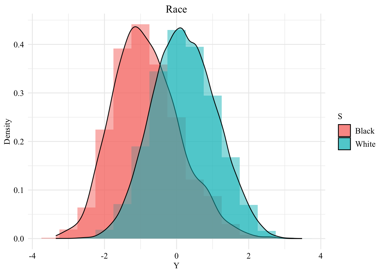
We create a dataset where the only protected class is the race, and we focus on Black individuals and White individuals only:
# Table for S = racedf_race <- df |>select( race, UGPA, LSAT, ZFYA ) |>filter( race %in%c("Black", "White") ) |>rename(S = race,X1 = UGPA,X2 = LSAT,Y = ZFYA ) |># no NA valuesmutate(S =as.factor(S) )
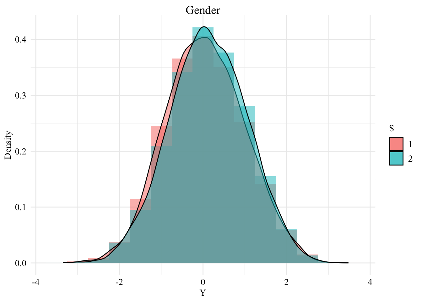
And another dataset in which the only protected class is the sex:
# Table for S = genderdf_gender <- df |>select( sex, UGPA, LSAT, ZFYA ) |>rename(S = sex,X1 = UGPA,X2 = LSAT,Y = ZFYA ) |># no NA valuesmutate(S =as.factor(S) )
Figure 6.2: Distribution of the standardized first-year law school grades among the two groups, when \(S\) is the gender
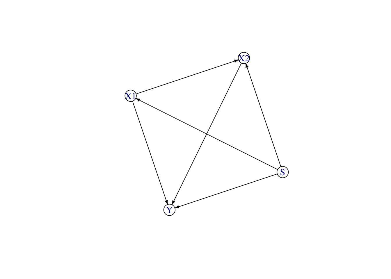
6.2 Causal graph
The assumed causal graph we use here is different from that of the different papers De Lara et al. (2024), Kusner et al. (2017), Black, Yeom, and Fredrikson (2020) using the same dataset.
We make the following assumptions:
The sensitive attribute, \(S\) (race), has no parents.
The two other explanatory variables, \(X_1\) (UGPA) and \(X_2\) (LSAT), both directly depend on the sensitive attribute.
The second variable, \(X_2\) (LSAT), also depends on the first variable, \(X_1\) (UGPA). This is done for illustrative purposes, assuming that the score obtained on the LSAT is influenced by the UGPA.
The two variables, \(X_1\) (UGPA) and \(X_2\) (LSAT), cause the target variable \(Y\), i.e., whether the student obtained a high standardized first-year average (ZFYA).
The corresponding Structural Equation Model writes:
\[
\begin{cases}
S: \text{ sensitive attribute (race)} \\
X_1 = h_1(S, U_1): \text{ UGPA, dependent on } S \\
X_2 = h_2(S, X_1, U_2): \text{ LSAT, dependent on } S \text{ and } X_1 \\
Y = h_3(X_1, X_2, U_Y): \text{ ZFYA, dependent on } X_1 \text{ and } X_2 \\
\end{cases}
\]
where \(U_1\), \(U_2\), and \(U_Y\) are independent error terms.
In R, we construct the upper triangular adjacency matrix to reflect our assumed causal structure:
Black, Emily, Samuel Yeom, and Matt Fredrikson. 2020. “Fliptest: Fairness Testing via Optimal Transport.” In Proceedings of the 2020 Conference on Fairness, Accountability, and Transparency, 111–21.
De Lara, Lucas, Alberto González-Sanz, Nicholas Asher, and Jean-Michel Loubes. 2021. “Transport-Based Counterfactual Models.”arXiv 2108.13025.
De Lara, Lucas, Alberto González-Sanz, Nicholas Asher, Laurent Risser, and Jean-Michel Loubes. 2024. “Transport-Based Counterfactual Models.”Journal of Machine Learning Research 25 (136): 1–59.
Kusner, Matt J, Joshua Loftus, Chris Russell, and Ricardo Silva. 2017. “Counterfactual Fairness.” In Advances in Neural Information Processing Systems 30, edited by I. Guyon, U. V. Luxburg, S. Bengio, H. Wallach, R. Fergus, S. Vishwanathan, and R. Garnett, 4066–76. NIPS.
Sander, Richard H. 2004. “A Systemic Analysis of Affirmative Action in American Law Schools.”Stan. L. Rev. 57: 367.